
Hero Image

Component Library

Welcome to the Southern Adventist University Component Library

This page serves as a central resource that includes website-building components, training, best practices, and related policies to create and maintain pages across the Southern website. Its purpose is to support a more consistent, accessible, and maintainable web experience by:
  • Maintaining consistent branding and page layouts across schools and departments
  • Simplifying content editing through form-based components
  • Supporting the implementation of scalable site-wide updates
  • Optimizing responsiveness for mobile devices
  • Enhancing visual engagement to improve readability and user experience
Components are regularly updated to reflect the latest functionality and supported versions. Each component includes a brief overview of its purpose and functionality, along with written step-by-step instructions (Read) and videos that walk users through how to use the components (Watch). These are the full lists of written and video tutorials.

Contact WebHelp Team

for questions, support requests, feedback, or design and feature suggestions

Hero

C01 Hero V1 - Landing Page

C01 Hero V1 - Landing Page

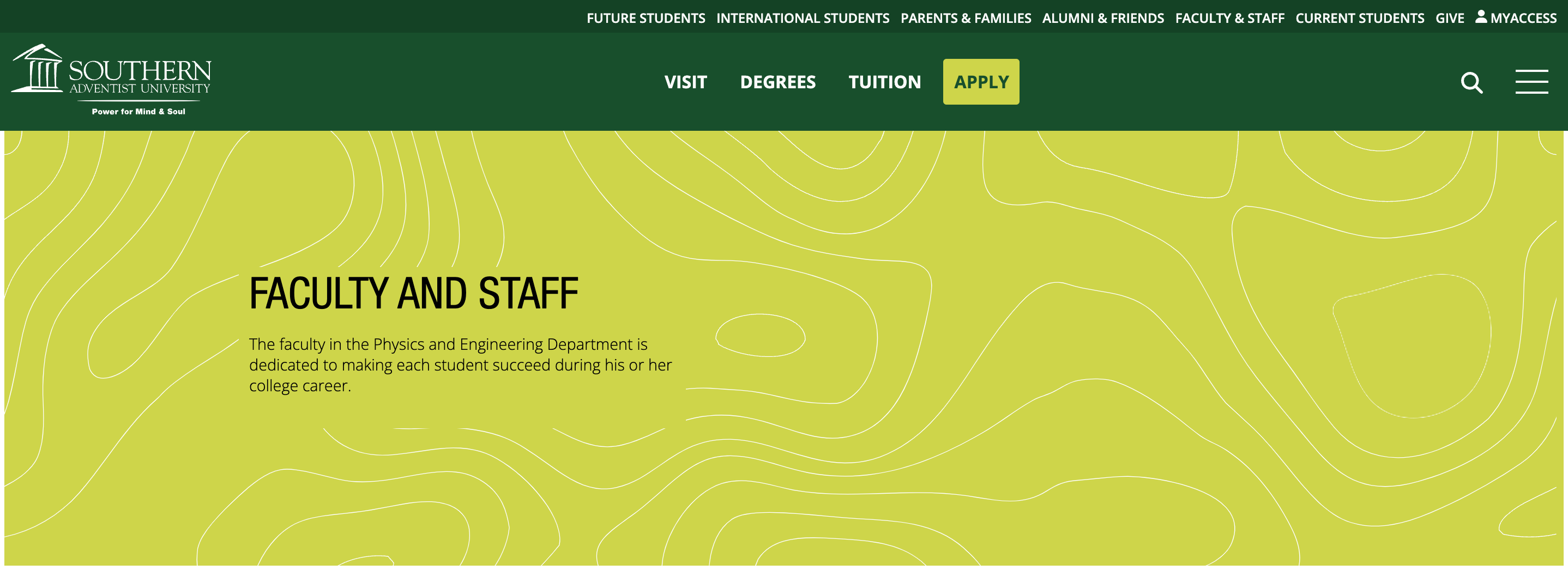
Hero V1 is designed exclusively for schools and departmental home (landing) pages. It serves as the primary page header to create visual and emotional impact. This component is automatically generated when a new landing page is created. Adding it to an interior page requires special permission from the MUR web team.

The header title (lime label) and background image are updated within the component. To change the page title (different from the header title), the Properties menu must be used. The background image must be high resolution, visually compelling, and directly relevant to the page content.

Please note that the following character limits apply:

  • Title: 3-60 characters

Read or Watch the step-by-step instructions on changing the image or title text. 

C01 Hero V2

C01 Hero V2

Hero V2 is designed as the page header that allows a short paragraph directly underneath the page title in the Hero area (on top of the image). It also supports up to two optional call-to-action buttons. The background image is fixed and cannot be changed. The header title, text, and buttons are updated within the component. To change the page title (different from the header title), the Properties menu must be used.

A Hero component is required on every page and should not be removed. Only one Hero component is permitted per page.

Please note that the following character limits apply:

  • Title: 3-60 characters

  • Intro description: 15-200 characters
  • Call-to-action button: 2-15 characters

Read or Watch step-by-step instructions. 

C01 Hero V3 - Interior Page

C01 Hero V3 - Interior Page

Hero V3 is designed as the page header for interior pages to create visual and emotional impact. It features a more compact layout than V1 and V2, allowing page content to appear higher on the screen. 

The header title (lime label) and background image are updated within the component. To change the page title (different from the header title), the Properties menu must be used. The background image must be high resolution, visually compelling, and directly relevant to the page content.

A Hero component is required on every page and should not be removed. Only one Hero component is permitted per page.

Please note that the following character limits apply:

  • Title: 3-60 characters

Read or Watch step-by-step instructions. 

Text blocks

C02 WYSIWYG

C02 WYSIWYG

The WYSIWYG* component is designed for creating paragraphs of formatted text. It supports bold, italic, and underlined styling as well as text alignment options, lists, and in-text links. Additionally, it provides an optional call-to-action button displayed beneath the text.

This component works similarly to other text formatting applications. The WYSIWYG component can be placed on two backgrounds: light green (default) or transparent. It also has two modes:
  • Default Paragraph: the standard text style (font size and layout) used for body content
  • Intro Paragraph: slightly enlarged font with an added left-side green border for emphasis
Please note that the following character limits apply:
  • Description: 15-350 characters
  • Call-to-action button: 0-60 characters
Read or Watch step-by-step instructions. 

------

* WYSIWYG stands for "What You See Is What You Get"


C03 Feature Thumbnail List

C03 Feature Thumbnail List

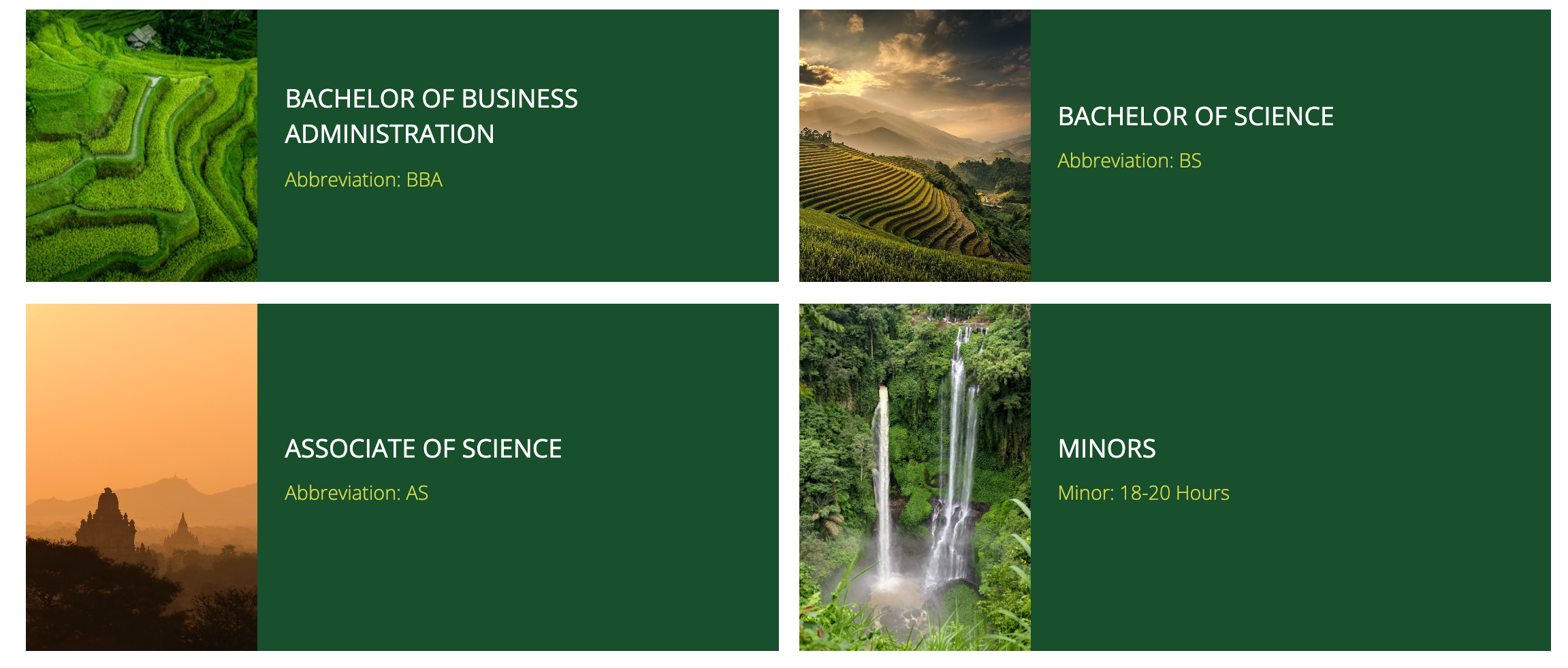
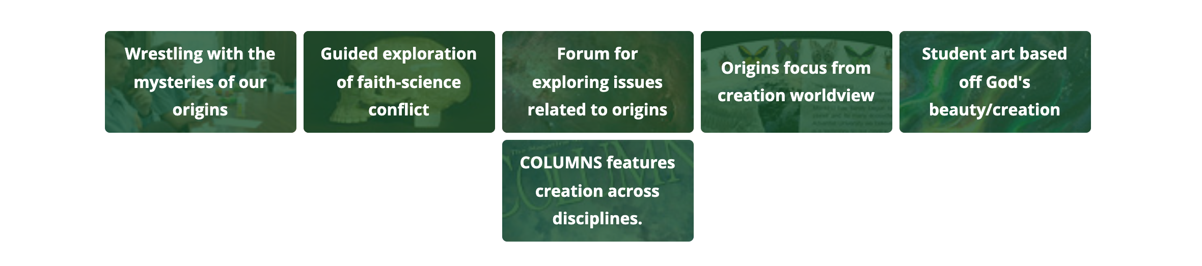
The feature thumbnail list component is good for presenting content in a visually driven, easily scannable way. The user can click on the image or the text to see more.
C04 1/2 Image 1/2 Text

C04 1/2 Image 1/2 Text

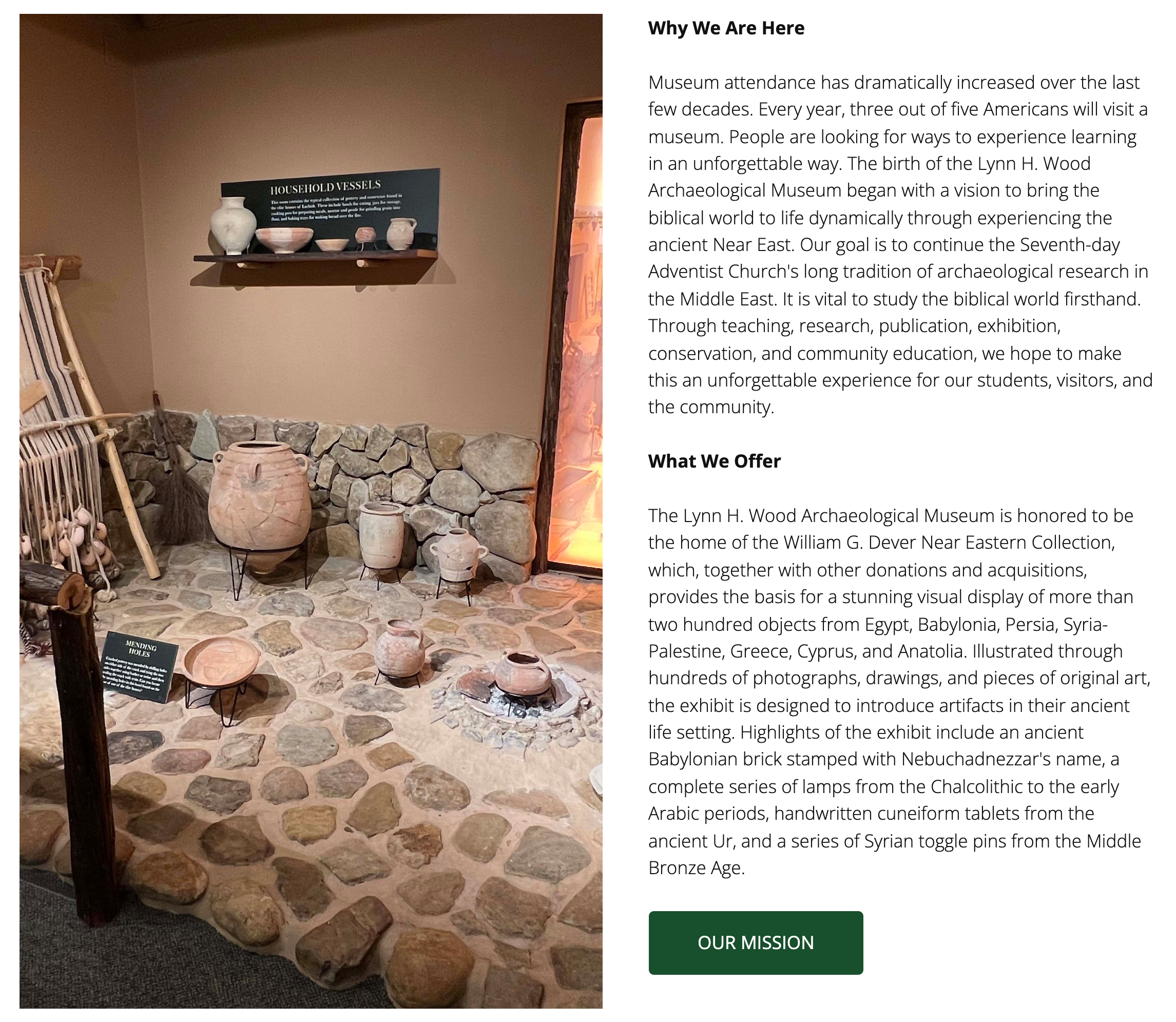
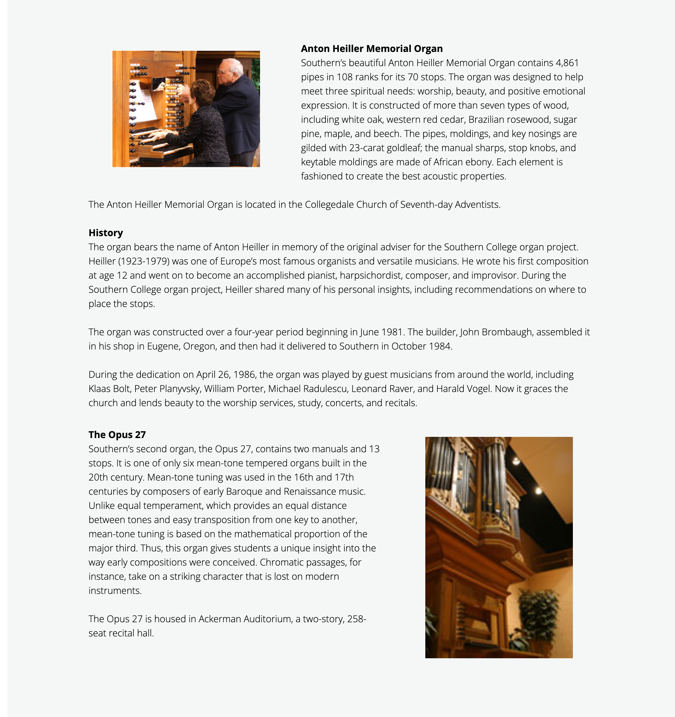
This component is for situations where a lot of text content is required on a page. It splits the page between images and text to make the content more visually interesting while allowing a lot of space to write text at length.
C19 Profile and Bio

C19 Profile and Bio

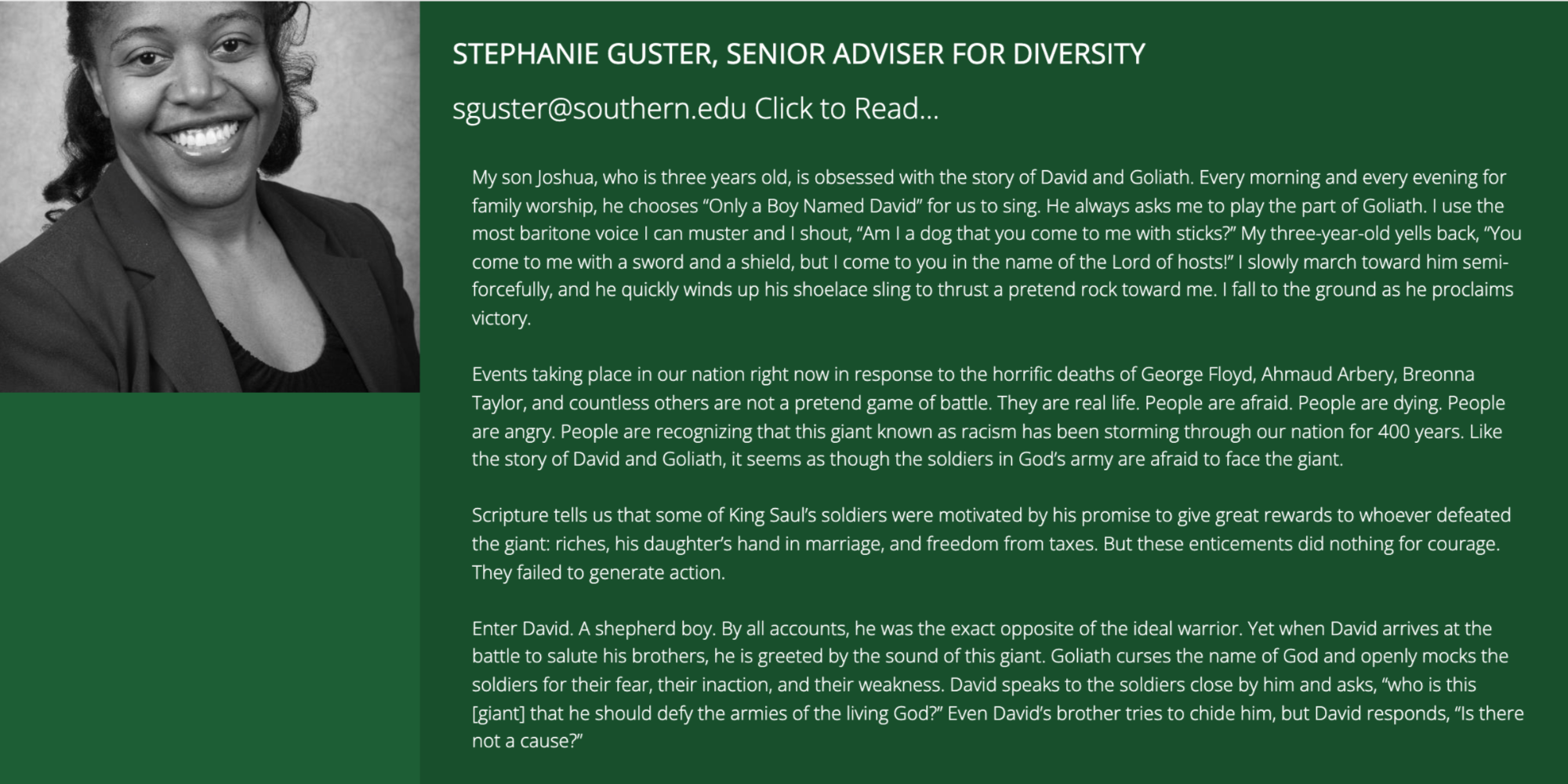
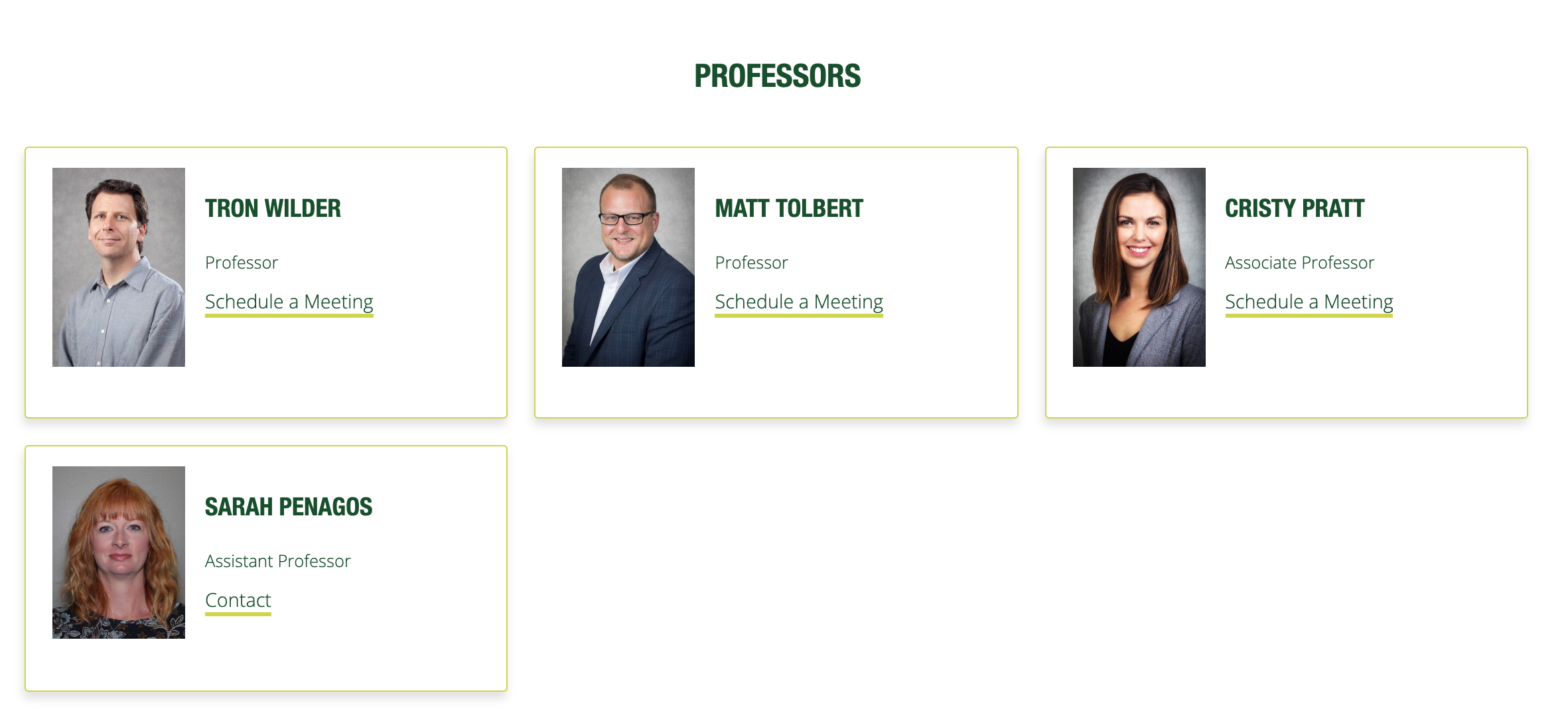
This is a great component for featuring your staff and a bio about them
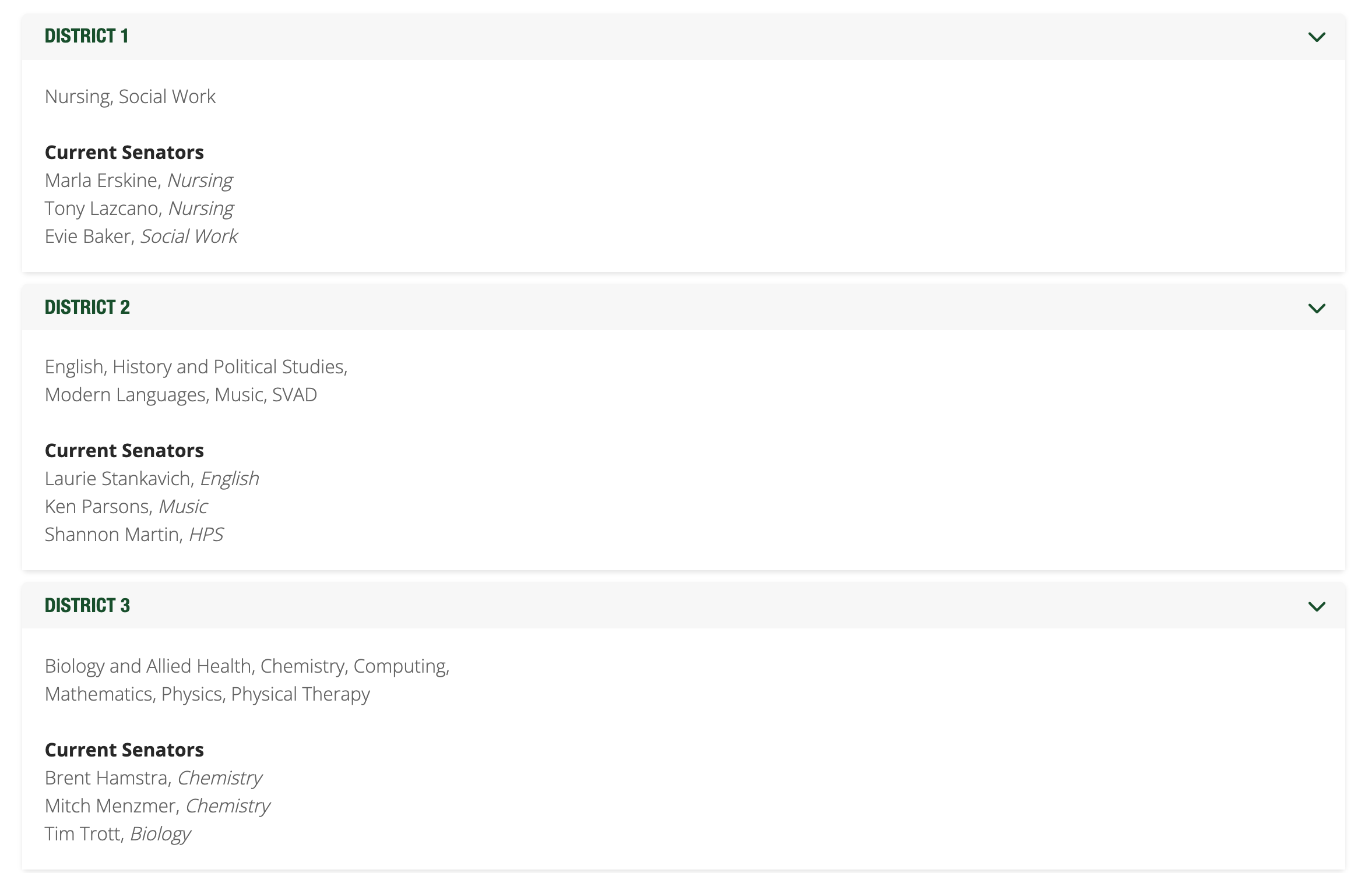
C20 Accordion

C20 Accordion

This component is great for frequently asked questions, but can be used anytime you want to make it easier to sort through large sections of text.
C21 Content with Thumbnails

C21 Content with Thumbnails

This component allows the user to create sections of content with relevant images, and the text nicely floats around the images.
C22 Alert

C22 Alert

This component is for notifying your visitors of some urgent or unusual change that may affect availability, offerings, or resources.
C23 Fine Print

C23 Fine Print

This component is for disclaimers and for notifying users about information they may need to know but that is not central to the message of the page.

C29 Featured Section

C29 Featured Section

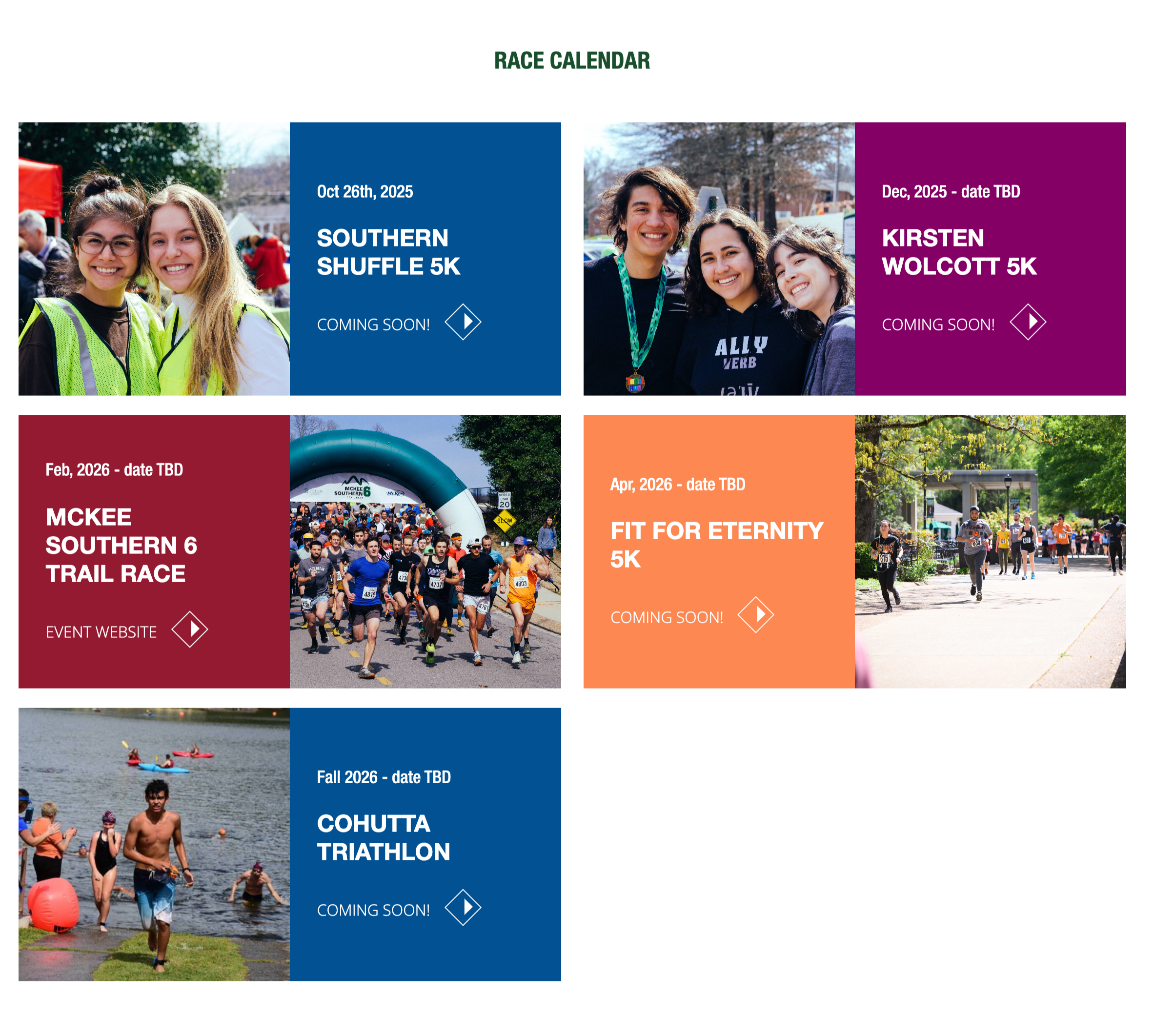
This component allows you to organize events with an optional link.
C33 Flipcards

C33 Flipcards

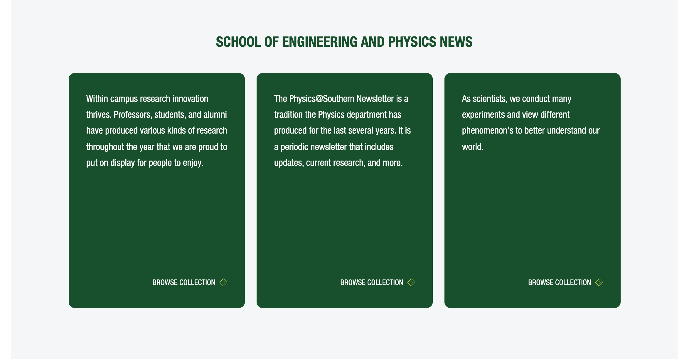
This component is a very nice way to feature information. Clicking the cards reveals more information and an optional link.
C34 Expandable cards

C34 Expandable cards

This component allows you to organize content with access to images and links.

Links/Buttons

C01 Hero V2

C01 Hero V2

This is a version of the hero component, and can be used if you have a paragraph of text you want to display in the hero/banner area of the page
C03 Feature Thumbnail List

C03 Feature Thumbnail List

The feature thumbnail list component is good for presenting content in a visually driven, easily scannable way. The user can click on the image or the text to see more.
C09 Card content

C09 Card content

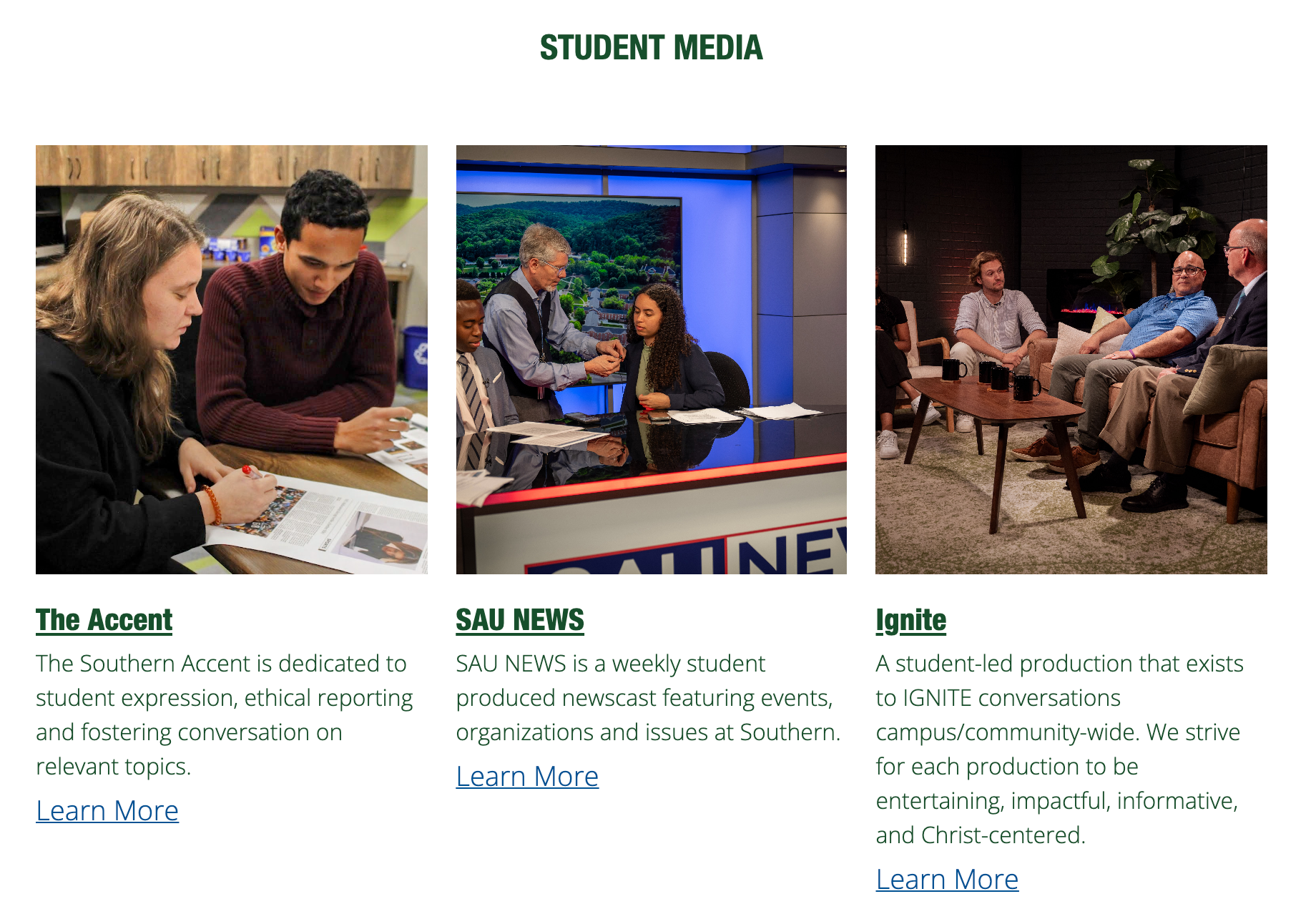
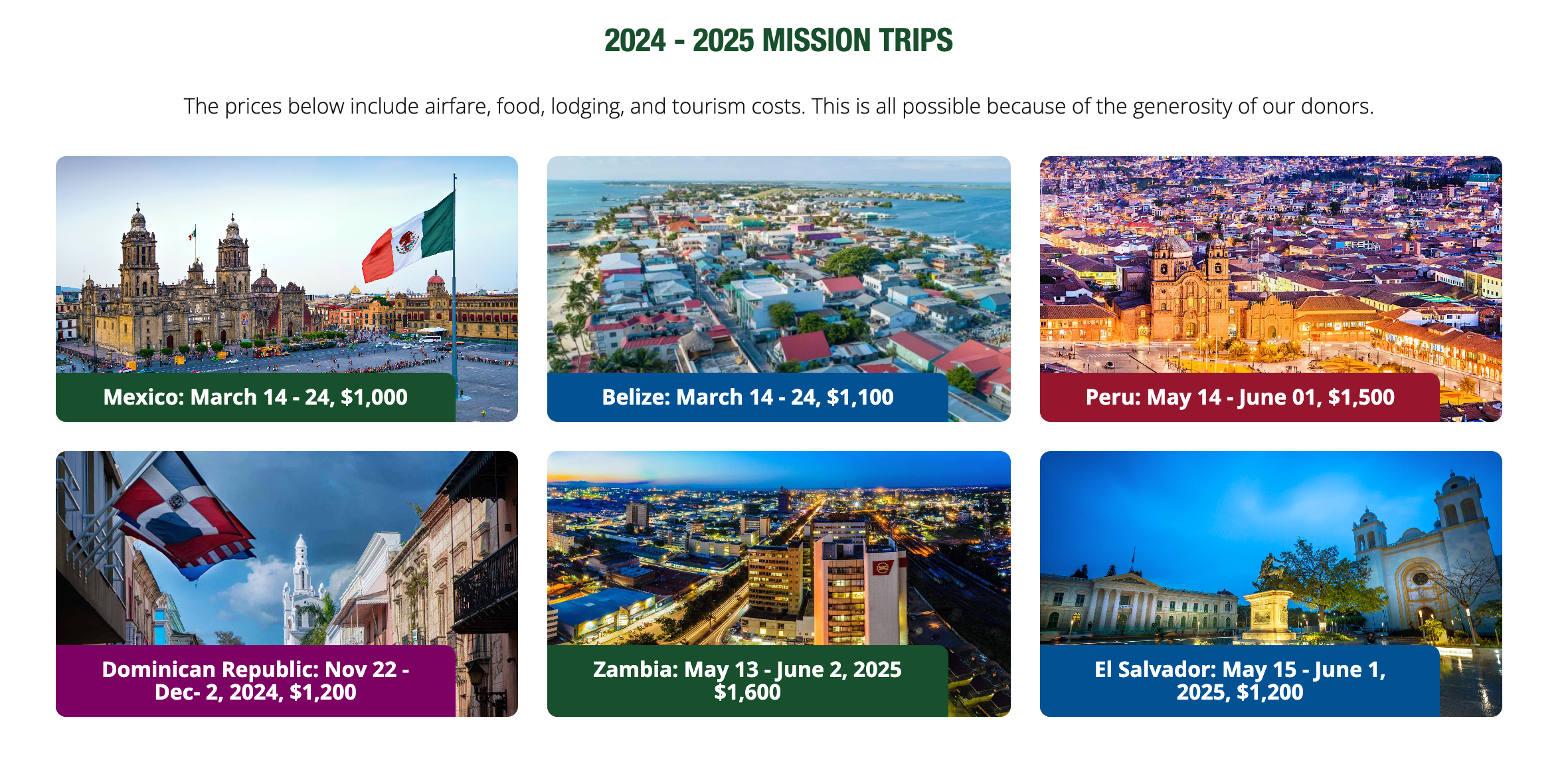
Display content with engaging images to support the words of the content. The editor can choose to display 3 or 4 cards across on desktop view.
C11 Call to Action V1

C11 Call to Action V1

C11 Call to Action V2

C11 Call to Action V2

C11 Call to Action V3

C11 Call to Action V3

C13 Social Follow

C13 Social Follow

The social follow component allows you to display links to your social media accounts. The social platforms supported by this component are:

  • Facebook
  • Instagram
  • Twitter
  • YouTube
  • LinkedIn
C14 Link list

C14 Link list

This component is great for giving the visitor options as it displays multiple (3+) links in one place. You can choose to have the links open in a new tab.
C15 Small thumbnail links

C15 Small thumbnail links

This component is for when you have a group of links to display and you need a small image to accompany each link.
C18 Resource cards

C18 Resource cards

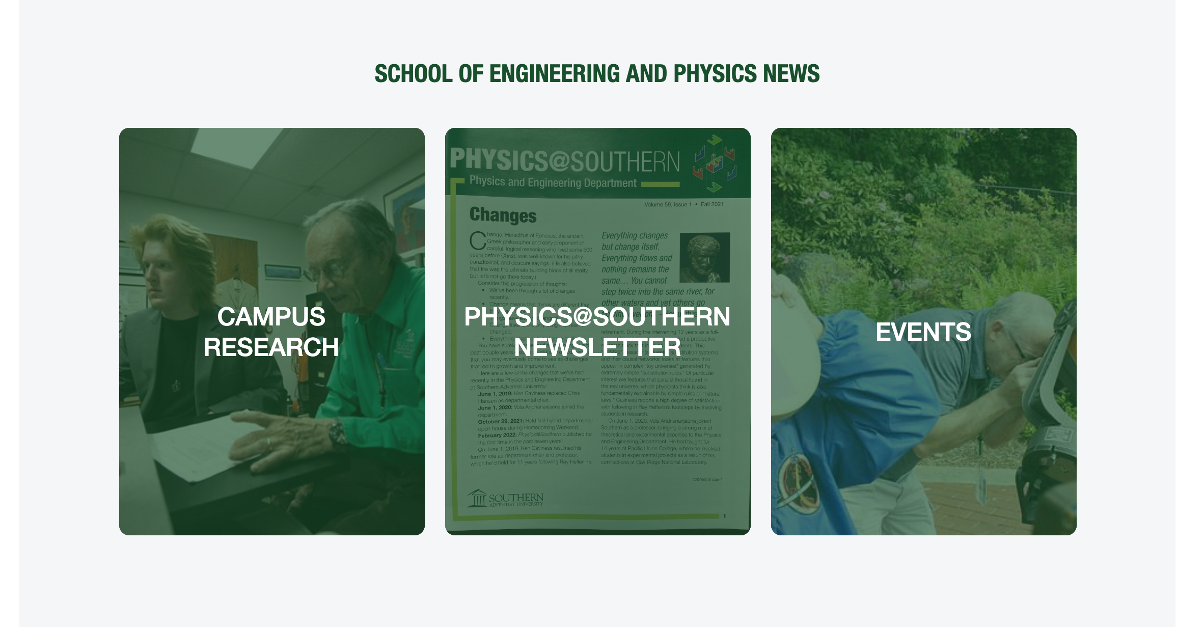
Resource Cards provide a great way to represent key features with an image and an inviting graphical link.
C27 Large thumbnail links

C27 Large thumbnail links

This component features large thumbnail image and a title. The entire card is a link.
C28 Upcoming events

C28 Upcoming events

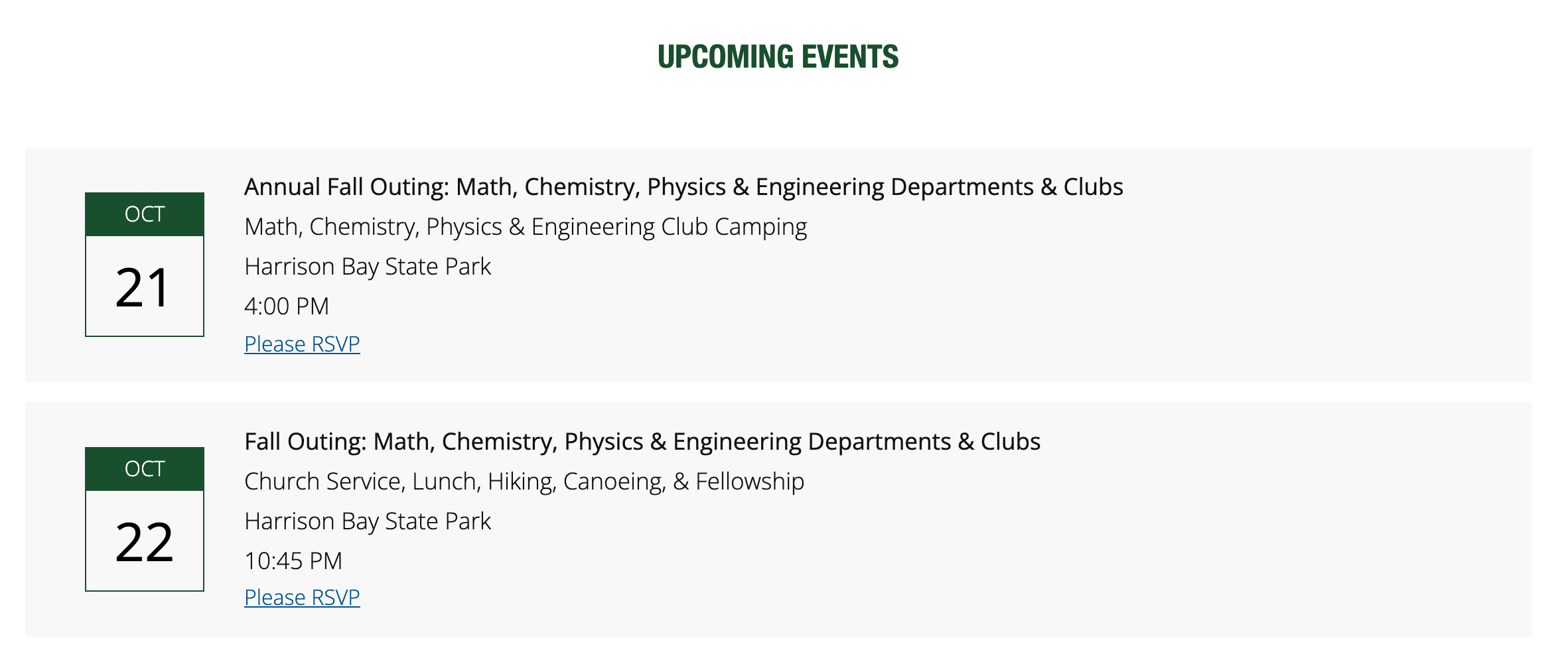
Used to display upcoming events by date.
C29 Featured Section

C29 Featured Section

This component allows you to organize events with an optional link.
C30 Image Link Grid

C30 Image Link Grid

Highlight your links with attractive, relevant images.
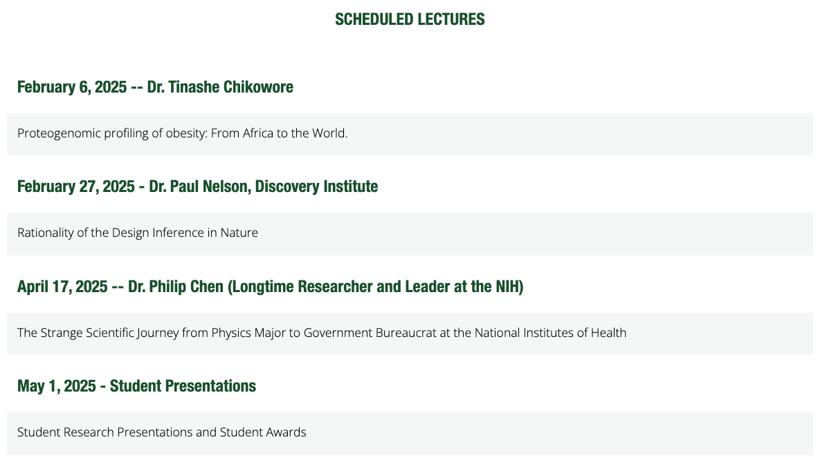
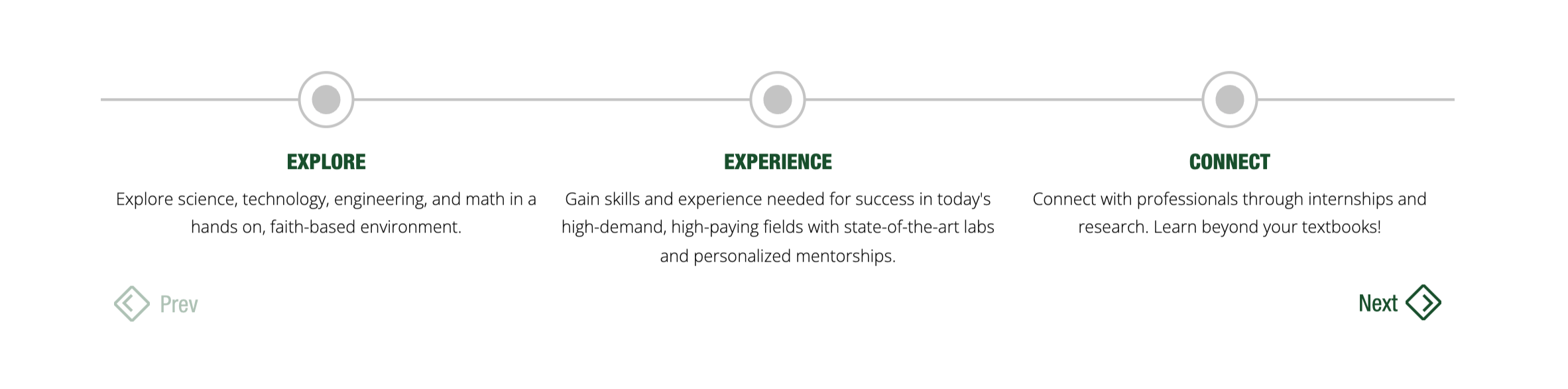
C32 Timeline

C32 Timeline

This component displays a small slideshow of a timeline of events.
C33 Flipcards

C33 Flipcards

This component is a very nice way to feature information. Clicking the cards reveals more information and an optional link.

Cards

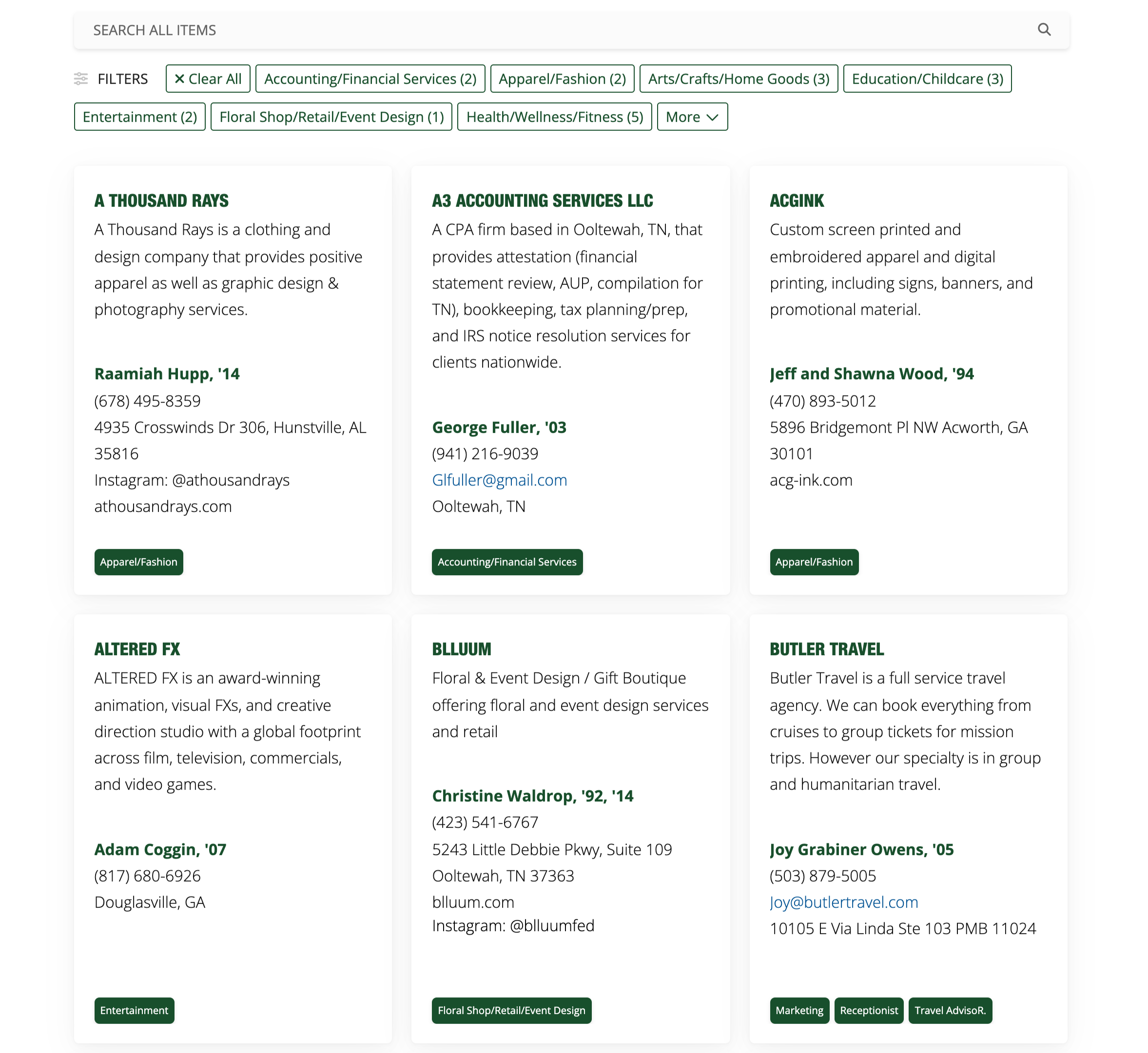
Cards are content block used to display a summary of content in a reusable format. It typically includes elements like a title, image, text or buttons

C03 Feature Thumbnail List

C03 Feature Thumbnail List

The feature thumbnail list component is good for presenting content in a visually driven, easily scannable way. The user can click on the image or the text to see more.
C07 Feature Tile Grid

C07 Feature Tile Grid

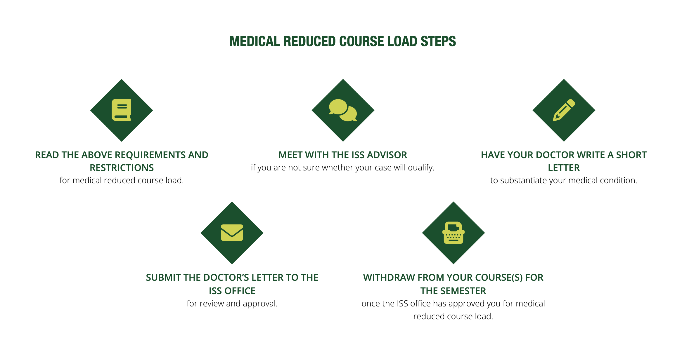
This component features key options or links using this grid of custom icons.
C09 Card Content

C09 Card Content

Display content with engaging images to support the words of the content. The editor can choose to display 3 or 4 cards across on desktop view.
C10 Gallery

C10 Gallery

This component provides an image gallery with optional captions.
C15 Small Thumbnail Links

C15 Small Thumbnail Links

This component is for when you have a group of links to display and you need a small image to accompany each link.
C18 Resource Cards

C18 Resource Cards

Resource Cards provide a great way to represent key features with an image and an inviting graphical link.
C19 Profile and Bio

C19 Profile and Bio

This is a great component for featuring your staff and a bio about them.
C24 Small Bio Cards

C24 Small Bio Cards

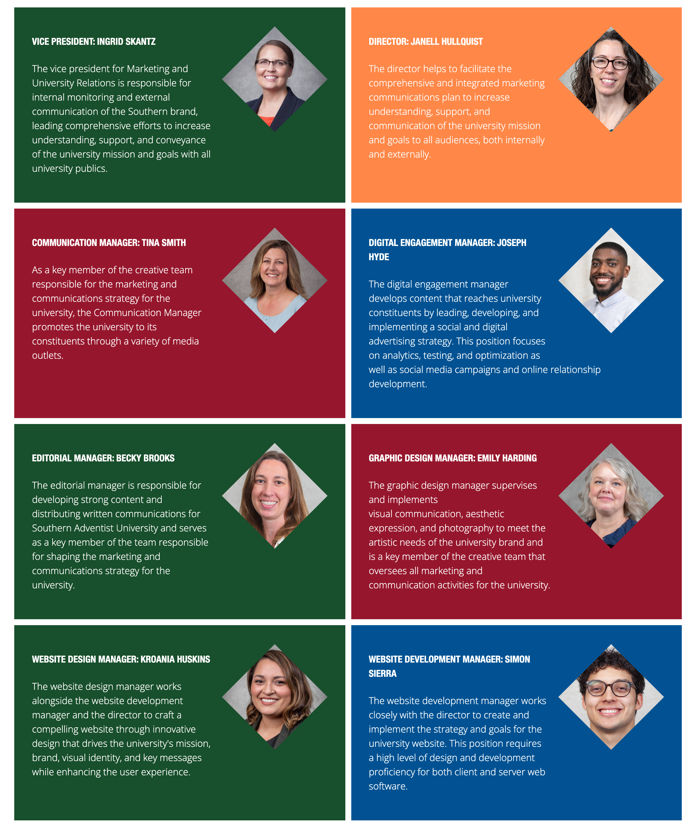
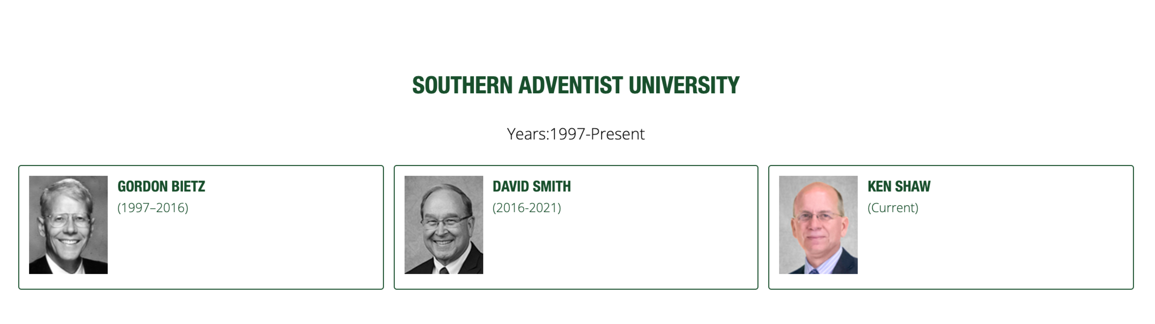
This component is for featuring bios when there are a lot of individuals to feature on one page.
C27 Large Thumbnail Links

C27 Large Thumbnail Links

This component features large thumbnail image and a title. The entire card is a link.
C29 Featured Section

C29 Featured Section

This component allows you to organize events with an optional link.
C30 Image Link Grid

C30 Image Link Grid

Highlight your links with attractive, relevant images.
C33 Flipcards

C33 Flipcards

This component is a very nice way to feature information. Clicking the cards reveals more information and an optional link.
C34 Expandable Cards

C34 Expandable Cards

This component allows you to organize content with access to images and links.

Lists

C07 Feature tile grid

C07 Feature tile grid

This component features key options or links using this grid of custom icons.
C08 Feature list

C08 Feature list

The feature list component allows the user to emphasize a list of items. The items can't be hyperlinked, so the component is just for ticking through a list of items to be featured.
C09 Card content

C09 Card content

Display content with engaging images to support the words of the content. The editor can choose to display 3 or 4 cards across on desktop view.
C14 Link list

C14 Link list

This component is great for giving the visitor options as it displays multiple (3+) links in one place. You can choose to have the links open in a new tab.
C15 Small thumbnail links

C15 Small thumbnail links

C18 Resource cards

C18 Resource cards

Resource Cards provide a great way to represent key features with an image and an inviting graphical link.
C19 Profile and bio

C19 Profile and bio

This is a great component for featuring your staff and a bio about them.
C20 Accordion

C20 Accordion

This component is great for frequently asked questions, but can be used anytime you want to make it easier to sort through large sections of text.
C27 Large thumbnail links

C27 Large thumbnail links

This component features large thumbnail image and a title. The entire card is a link.
C28 Upcoming events

C28 Upcoming events

Used to display upcoming events by date.
C30 Image link grid

C30 Image link grid

Highlight your links with attractive, relevant images.
C32 Timeline

C32 Timeline

This component displays a small slideshow of a timeline of events.
C33 Flipcards

C33 Flipcards

This component is a very nice way to feature information. Clicking the cards reveals more information and an optional link.
C34 Expandable cards

C34 Expandable cards

This component allows you to organize content with access to images and links.

Images

C01 Hero v3

C01 Hero v3

C03 Feature thumbnail list

C03 Feature thumbnail list

The feature thumbnail list component is good for presenting content in a visually driven, easily scannable way. The user can click on the image or the text to see more.
C04 1/2 Image 1/2 Text

C04 1/2 Image 1/2 Text

This component is for situations where a lot of text content is required on a page. It splits the page between images and text to make the content more visually interesting while allowing a lot of space to write text at length.
C09 Card content

C09 Card content

Display content with engaging images to support the words of the content. The editor can choose to display 3 or 4 cards across on desktop view.
C10 Gallery

C10 Gallery

This component provides an image gallery with optional captions.
C11 Call to Action V2

C11 Call to Action V2

C15 Small thumbnail links

C15 Small thumbnail links

This component is for when you have a group of links to display and you need a small image to accompany each link.
C18 Resources cards

C18 Resources cards

Resource Cards provide a great way to represent key features with an image and an inviting graphical link.
C19 Profile and Bio

C19 Profile and Bio

This is a great component for featuring your staff and a bio about them.
C21 Content with thumbnails

C21 Content with thumbnails

This component allows the user to create sections of content with relevant images, and the text nicely floats around the images.
C24 Small bio cards

C24 Small bio cards

This component is for featuring bios when there are a lot of individuals to feature on one page.
C27 Large thumbnail links

C27 Large thumbnail links

This component features large thumbnail image and a title. The entire card is a link.
C30 Image link grid

C30 Image link grid

Highlight your links with attractive, relevant images.
C33 Flipcards

C33 Flipcards

This component is a very nice way to feature information. Clicking the cards reveals more information and an optional link.
C34 Expandable cards

C34 Expandable cards

This component allows you to organize content with access to images and links.
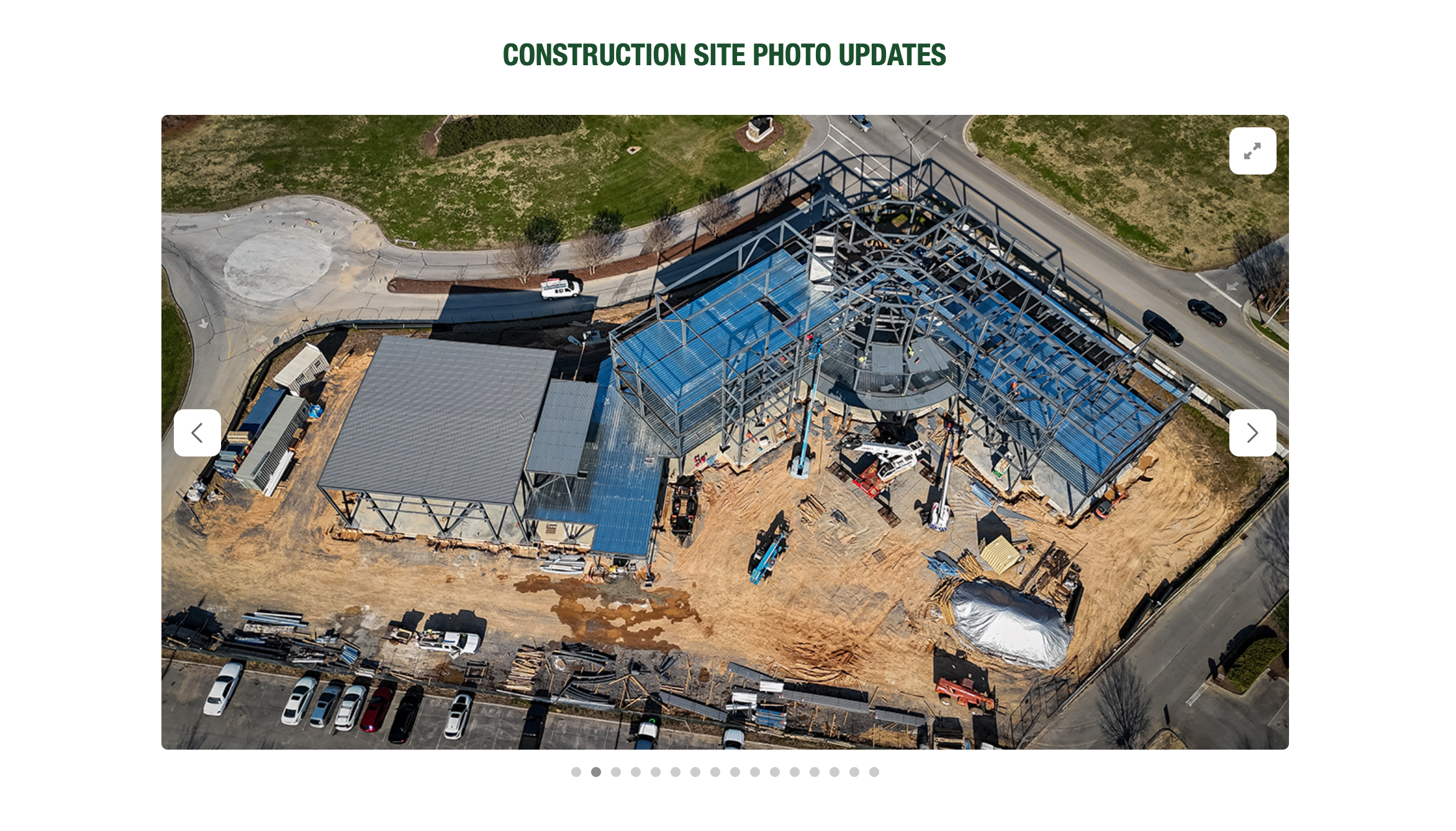
C41 Carousel

C41 Carousel

This component gathers many photos together in a carousel.
It allows for a simple caption per image and the ability to view the images fullscreen.

Media

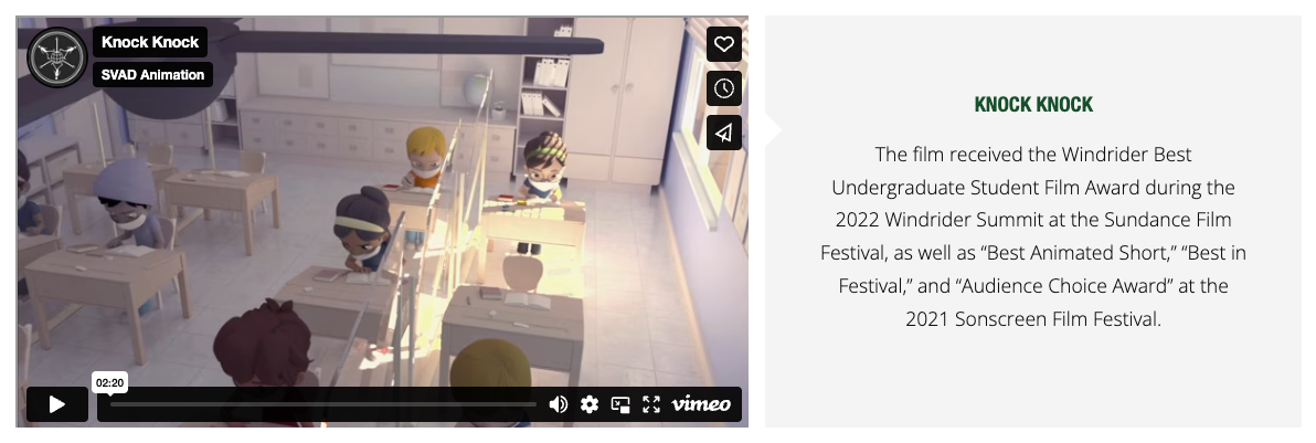
C05 Vimeo video

C05 Vimeo video

This component facilitates easily adding a Vimeo video embed and ships with a nice title and description area as well as an optional call to action button.
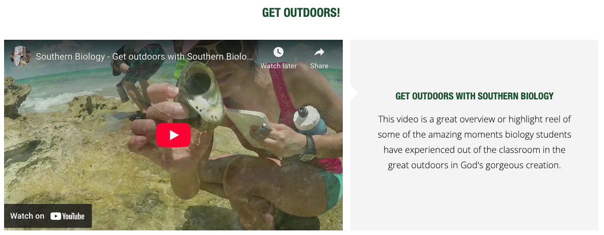
C05 Youtube Video

C05 Youtube Video

This component facilitates easily adding a Youtube video embed and ships with a nice title and description area as well as an optional call to action button.

Contacts and Call to Actions

Lorem ipsum dolor et

C06 Contact

C06 Contact

Use the contact section to add departmental names, phone numbers, email addresses and hours of availability.
C11 Call to Action V1

C11 Call to Action V1

C11 Call to Action V2

C11 Call to Action V2

C13 Social Follow

C13 Social Follow

The social follow component allows you to display links to your social media accounts. The social platforms supported by this component are:

  • Facebook
  • Instagram
  • Twitter
  • YouTube
  • LinkedIn
C14 Link list

C14 Link list

This component is great for giving the visitor options as it displays multiple (3+) links in one place. You can choose to have the links open in a new tab.
C23 Fine Print

C23 Fine Print

This component is for disclaimers and for notifying users about information they may need to know but that is not central to the message of the page.